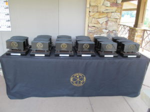
We’re getting a lot of calls about trophies lately, and we’re gearing up for a great 2017 trophy season. If you want some inspiration, here’s what we’ve been up to lately on the award side of things.
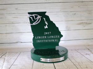
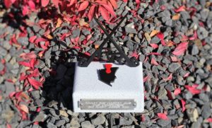
The Masters awards in the shape of your state have been getting quite a few requests. Our welder might not be a fan of it, but the uniquely shaped awards are really cool.
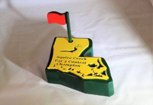
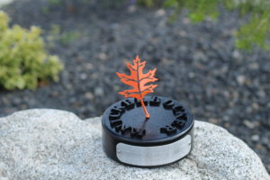
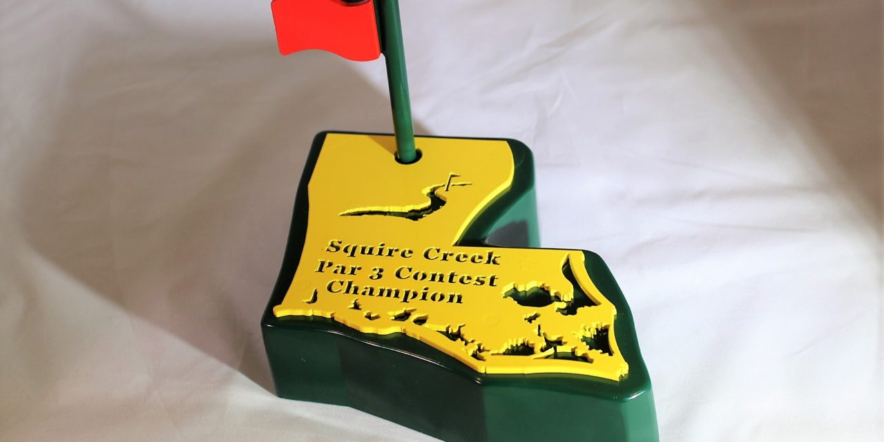
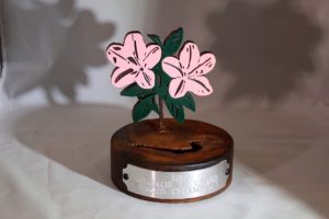
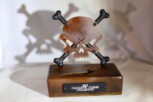
Squire Creek CC did that Par 3 award (above) and (below) the flower trophy, as well as the scary skull/crossbones. Here’s an easy example of how we can make each of your awards look different from each other if you’d like. That way each tournament has their own unique identity/brand. Or we can keep it consistent. Whatever you prefer.
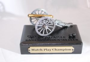
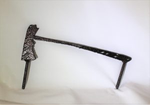
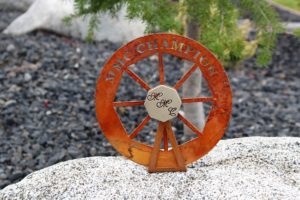
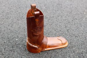
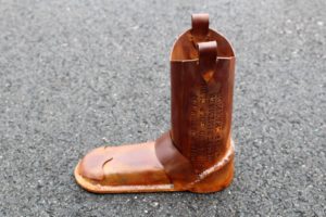
Next is the cannon awards for Gaillardia. We really like these and they work great for matchplay trophies.
Here’s another state themed trophy but in a different style. Reynolds Lake Oconee asked us to make these a 2nd year in a row.
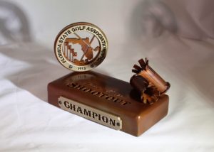
Here’s what the Florida State Golf Association had us do for their shootout events. Their logo looks really nice, but we can also make a skeet there in case its a skeet shooting event.
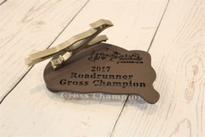
2nd roadrunner themed award for La Quinta CC. To mix things up for this event, we changed the shape of the base from rectangle to a ‘freehand’ shape. We got a little artistic here.
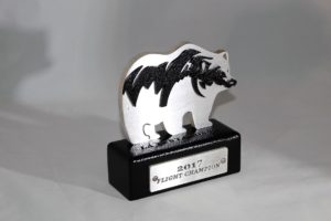
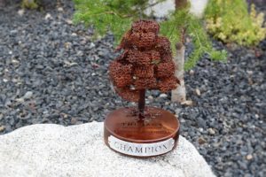
Have you been searching for a bear trophy? Here’s a flight winner award that’s bear themed for Toscana CC.
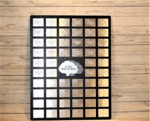
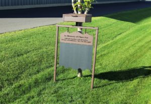
Here’s the Hole In One Plaque that we made for Twin Orchards.
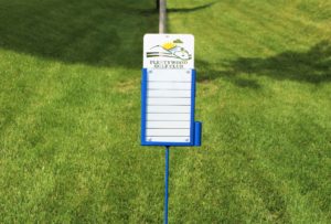
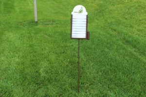
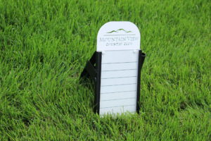
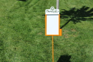
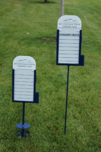
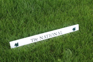
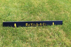
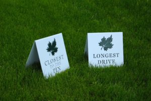
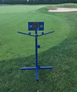
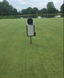
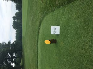
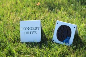
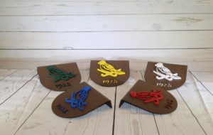
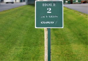
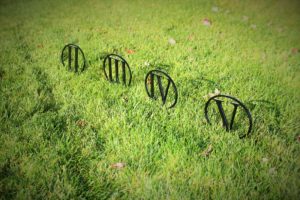
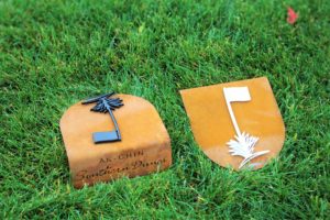
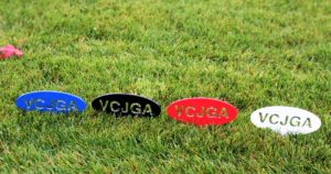
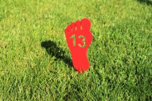
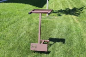
Besides trophies, we’ve been busy with tee markers lately. Here’s a look at what some other courses are up to.
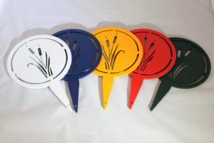
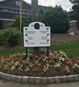
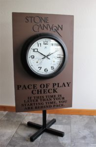
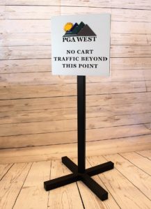
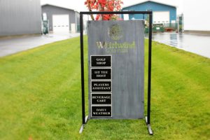
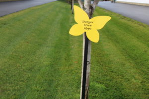
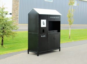
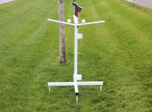
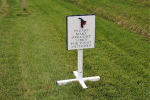
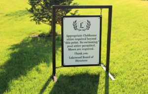
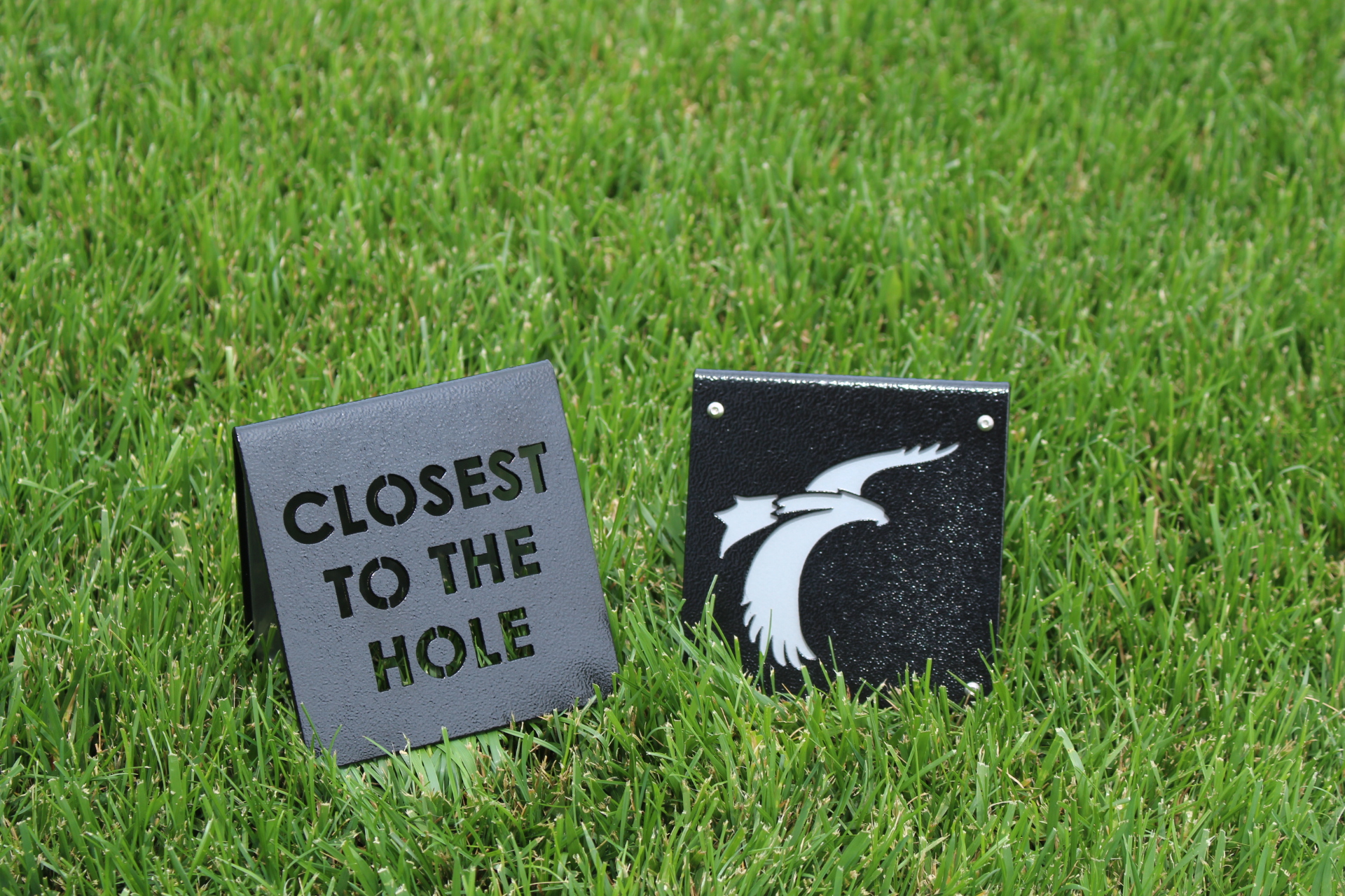
For Signs we have the Pace of Play Check Sign for Stone Canyon, & the PGA West ‘NO CARTS’ sign.
That’s all for today’s blog. Thanks, and have a great weekend!

 2. We finalized the details on the Pied Piper trophy with Jonathan’s Landing while Hurricane Matthew was raging and clients were evacuating. Member-dedication doesn’t get much better than that!
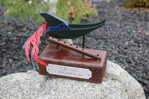 3. The Gobbler was a fun theme to work with, and actually was the first trophy that our newest designer, Zach ever created. Our crew built an extra for his desk to commemorate this achievement.
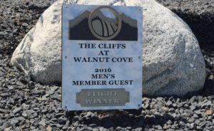
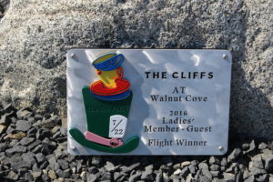
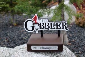 4. The Cliffs showcased their logo for their couples tournament, and broke from their usual copper vein with cool silver.
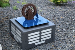
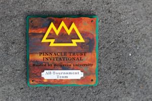
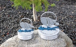 5. Spanish Peaks‘s perpetual trophy for their inter-club battle. The ‘mountain’ has each of the 3 participating clubs’ logos cut out, and the mountain rotates so that the winning team each year can have their logo in front. That was Reid’s idea (owner of RHI).
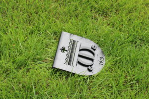
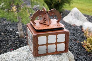 6. Lakewood CC had us re-create their 1941 Victory Invitational pamphlet for their perpetual trophy.
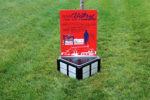
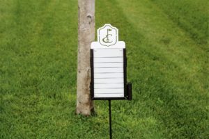
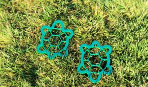
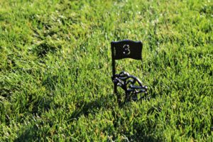

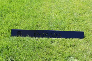
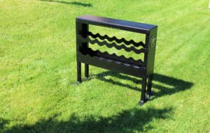
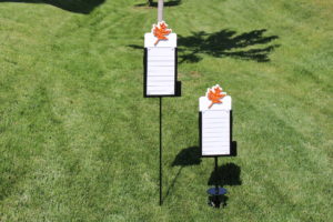
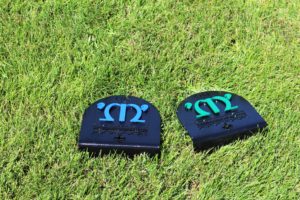
 These are the tee markers that have just gone out for Plantation, and Woodmont’s North course.
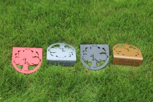
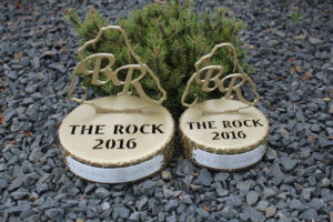
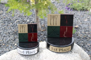
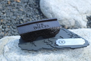
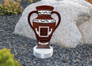
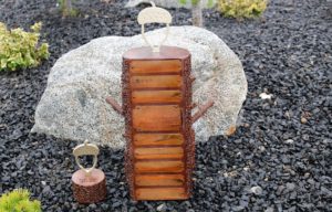
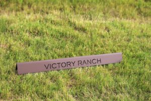
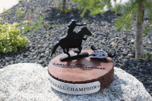
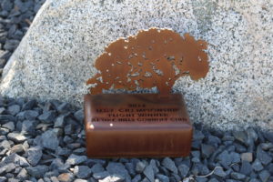
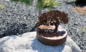
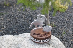
 Lastly, are the trophies that we’ve done in the last week. Notice how different each can be. The first two are for Rock Creek Cattle Company.
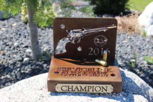
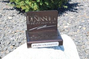
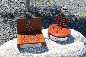
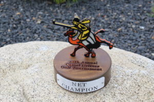
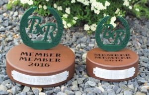
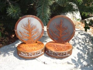
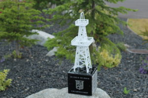
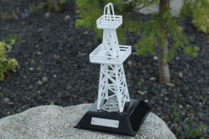
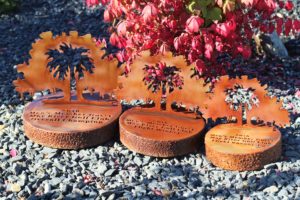
 5. For Boulder Ridge we did 2 of their summer event trophies, but made each look completely different.